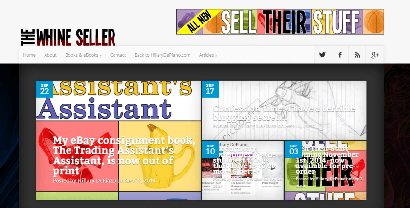
As promised, I’ve been working to redo The Whine Seller with a more responsive and mobile friendly design with the aim of making it easier for people to experience the site on tablets, smartphones and whatever else you’re looking at this on. I wanted to get this changeover done before the release of Sell Their Stuff so that my marketing efforts weren’t directing people to a site that was old and busted and I just made the new theme live a few days ago. I might still be changing things over the next few weeks, in particular I want to find a way to work the sassy avatar of me from the header that everyone liked so much back into this design somehow, but shouldn’t be changing the theme itself again before the New Year.
I am, in truth, not completely in love with this theme like I am with how HillaryDePiano.com came out. It was just the first one that did what I wanted it to and was fairly quick to implement so, please, don’t be afraid to give me your honest feedback on it.
There are a few neat little features I wanted to point out.
- Better content discovery. In the sidebar, you’ll notice a little tabbed widget that shows you not only recent posts but what’s popular. You can view the most popular posts on the site by the day, week month or even the most popular posts of all time. There’s also a nice new visually pleasing widget under each article that recommends related posts you may also like as well as a special widget under the comments that shows you recent discussions you may want to chime in on. This site is huge and I’ve written a lot of content over the years and I wanted to make it easier to discover posts from the archives.
- Evergreen posts are ever so much easier to find. Under the articles menu on the header, you can now browse all the posts in the Timeless category all in one place. Some are missing but I’m gradually making my way back through the archives adding posts to that category as needed. It’s a great way to scan through everything I’ve ever written that still holds true no matter when I wrote it.
- Responsive design means it’s really freaking responsive. Go ahead, resize the window a bunch of times. Load it on your cell phone, your tablet, your fancy computer-watch you wizard from the future, you. While I may not be in love with every element of the design of the site, I do love how it just makes the content work wherever you load it. That said, if something looks funky on your end, please let me know. Not all of my plugins play nice with the responsiveness.
So, please, look around the new site and let me know what you think. I know it’s a big change but I think the new magazine format better reflects the type of site this is than the old blog style did.
I’m going to leave you with a bit of trivia. See the dark abstract artwork behind the featured posts on the homepage? That’s actually the exact same background as what’s on HillaryDePiano.com right now. It’s just inverted which seemed appropriate for the two halves of my blogging personality.


 RSS - Posts


![Setting Better Creative Goals [Zoom Writing Workshop] at GSRW on March 28 @ 1:30 pm – 2:30 pm EST](https://i0.wp.com/www.hillarydepiano.com/pages/wp-content/uploads/Goal-Setting-Workshop.png?fit=1080%2C1080&ssl=1)

Join my mailing list!
Hear about new releases, special offers and upcoming sales before anyone else or opt into monthly blog digests and never miss a post!
You have Successfully Subscribed!